Bitcoin Rainbow Chart Explained: What the BTC Rainbow Chart Shows and How to Use It
Introduction
The cryptocurrency market resembles a roller coaster where Bitcoin’s price skyrockets or plummets in days. In this chaos, investors need a tool to bypass daily “noise” and view the market globally. The Bitcoin Rainbow Chart serves this purpose as one of the most popular tools for analyzing long-term trends.
While standard candle charts and RSI indicators confuse beginners, the Bitcoin Rainbow transforms complex logarithmic regression into an intuitive color scheme. Instead of panicking during pullbacks, BTC Rainbow Chart users simply check the current color band to assess market sentiment. This perspective helps maintain composure when headlines scream about Bitcoin’s “death” or an inevitable rise to millions.
However, the rules remain clear: the Rainbow Chart Bitcoin provides no financial advice and lacks a strict scientific basis. Essentially, it offers an engaging way to visualize historical data, helping investors see the big picture while ignoring the short-term volatility that distracts even experienced players.
This article examines how this “crypto-rainbow” works and why it became a cultural phenomenon. We also discuss why the original model failed in 2022 and how the updated 2023 version identifies phases of market overheating or undervaluation. If you want to make balanced decisions by distinguishing true fear from unjustified euphoria, this guide will be your reliable companion.
What Is the Bitcoin Rainbow Chart?
For anyone who has tried to decipher cryptocurrency charts even once, the bitcoin rainbow chart feels like a breath of fresh air amidst dry numbers and complex Japanese candlesticks. Essentially, it is a powerful visualization tool that overlays a rainbow color palette onto the Bitcoin price chart to help investors assess the current market situation through the lens of history.

Bitcoin Rainbow Chart Definition
Formally, the btc rainbow chart is a chart built on a logarithmic regression curve. Unlike standard linear charts, this tool utilizes years of historical data to create a “growth corridor” for the first cryptocurrency.
The core idea of the crypto rainbow chart is that Bitcoin’s price, despite its volatility, tends to follow a specific long-term trajectory. The chart is divided into several color zones: from cold blue shades at the bottom to hot red ones at the top. Each band represents a specific percentile of probable outcomes:
- The bottom part of the rainbow reflects the 1st percentile, representing the most pessimistic forecasts. If the price is here, the asset is considered extremely undervalued.
- The top part of the rainbow represents the 99th percentile, the most optimistic scenario. Price presence in this zone signals that the market is overheated and BTC is likely overvalued.
Thus, the rainbow chart bitcoin serves as a simple visual guide, allowing one to understand where the coin stands relative to its historical norm.
Origin of the Rainbow Chart Model
The history of this tool is a prime example of how ideas within a community turn into legendary analytical models. The bitcoin rainbow was not created within the walls of a major investment bank; its roots go back to discussions on Reddit, and it gained widespread fame thanks to the Blockchaincenter platform.
The model is constantly evolving. When Bitcoin behaved unpredictably in 2022 and temporarily “fell out” of the boundaries of the old chart, developers introduced an updated version—Rainbow 2023.
- The new model is based on a completely revised formula taking data through the end of 2022 into account.
- Mathematically, this is implemented by fitting two curves: one perfectly describes historical maximums (the red line), and the other describes minimums (the blue line).
- The space between them is filled with rainbow colors through interpolation.
Despite the complexity of the calculations behind the chart, its creators emphasize that the model has no strict scientific basis. It is rather an engaging way to look at the market by cutting out unnecessary “noise”.
Why It Became Popular Among BTC Investors
The popularity of the rainbow chart btc is explained by the psychology of trading. Most investors dream of “catching the bottom” and selling at the very peak, but emotions—fear and greed—often prevent rational decision-making. The rainbow btc chart offers a kind of “cure” for these emotions.
Investors love this tool for several reasons:
- Simplicity: You don’t need to be an expert in technical analysis to understand that blue means a “sale” and red means it’s “time to get out”.
- Long-term perspective: The chart ignores daily volatility, which often misleads traders.
- Historical context: The model shows that even the deepest drops in Bitcoin’s past were merely temporary episodes within a global upward trend.
While rainbow bitcoin cannot be used as the sole signal for buying or selling, it has become an integral part of crypto culture, reminding us that Bitcoin is an asset that moves in cycles.
How the BTC Rainbow Chart Works
To truly understand how the bitcoin rainbow chart works, one must stop looking at it as just a “pretty picture”. Behind the colorful bands lies a mathematical model that attempts to describe the exponential growth of digital gold. Instead of predicting an exact price for tomorrow, the btc rainbow chart creates a probability corridor based on how the asset has performed over the last ten years.
H3: Logarithmic Price Scale Explained
The first thing that stands out when looking at the bitcoin rainbow price chart is its unusual shape. Unlike standard financial charts, it uses a logarithmic scale.
This is crucial for Bitcoin because of the way its value has scaled. On a standard (linear) chart, the distance between $1 and $100 looks tiny compared to the gap between $60,000 and $70,000. However, for an investor, a rise from $1 to $100 is a 100x increase in capital, while a move from $60,000 to $70,000 is only about a 16% gain. The logarithmic scale equalizes these changes by focusing on percentage growth rather than absolute values. This is why the rainbow bitcoin chart appears as a smooth curve that gradually flattens, reflecting the asset’s maturation and the gradual decrease in its volatility.
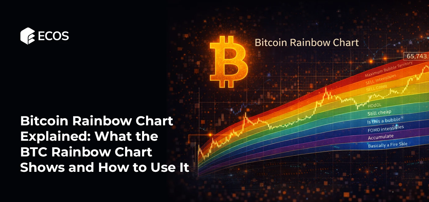
Color Bands and Their Meaning
The most recognizable feature of the crypto rainbow chart is its nine colored bands, each featuring a unique (and sometimes ironic) label. These levels allow users to quickly identify the market phase without studying complex oscillators.
In the classic model, the colors signify the following:
- Dark Red (Maximum Bubble Territory): A time for extreme caution.
- Red (Sell. Seriously, SELL!): A strong signal to exit.
- Dark Orange (FOMO intensifies): Greed is taking over the market.
- Light Orange (Is this a bubble?): Questioning the sustainability of the rally.
- Yellow (HODL!): A period to simply hold coins and avoid rash moves.
- Light Green (Still cheap): An attractive entry point for buyers.
- Green (Accumulate): The active accumulation phase.
- Light Blue (BUY!): A strong buy signal.
- Blue (Basically a Fire Sale): Historically the best entry points.
Occasionally, a “Bitcoin is dead” band is added below the blue zone to ironically highlight moments of maximum media pessimism, which often coincide with market bottoms.
What Each Zone Signals to Investors
Statistically, the rainbow chart btc relies on a probability distribution. The lower boundaries represent the 1st percentile—the most pessimistic forecasts based on historical lows. When the price touches the blue zone, it signals that the asset is extremely undervalued relative to its long-term growth trajectory.
The upper boundaries (red zones) represent the 99th percentile—maximum optimism scenarios. When the price is in this area, the market is overheated, demand has reached unprecedented levels, and the probability of a correction is extremely high. Thus, the rainbow btc chart serves as a visual indicator of how far the current price has deviated from its “fair” regression line.
Reading the Bitcoin Rainbow Chart
Learning to read the bitcoin rainbow chart means learning to see market cycles through the lens of historical probability. This tool does not provide exact “to the dollar” predictions, but it excels as a compass indicating which phase of the market cycle we are currently in. The fundamental rule is simple: the closer the price is to the cold colors (blue), the higher the probability of long-term growth, and vice versa.
Undervalued vs Overvalued Zones
The primary value of the btc rainbow chart lies in dividing market conditions into undervalued and overvalued zones based on statistical probabilities.
- Undervalued Zones: The lower part of the rainbow, represented by blue and green colors, corresponds to 1st percentile outcomes. Historically, the price has very rarely dropped below these levels. When the rainbow chart bitcoin shows the price in the “Basically a Fire Sale” zone, it signals that the asset is trading at a massive discount relative to its long-term growth trajectory.
- Overvalued Zones: The upper bands—from bright orange to dark red—represent the 99th percentile. This is the territory of maximum optimism, where demand for Bitcoin often reaches unsustainable heights. Being in the “Maximum Bubble Territory” warns an investor that the market is overheated and the probability of a painful correction is extremely high.
Investors often use these zones to calibrate their strategies, trying to avoid buying in “red” zones and selling in “blue” ones.
Identifying Long-Term Trends
One of the main tasks of the rainbow chart btc is helping to identify global trends stripped of daily volatility. The cryptocurrency market is famous for its “noise,” where breaking news can significantly move the price in an hour, confusing long-term holders.
The logarithmic regression at the core of the rainbow btc chart allows one to see that, despite all local drops, Bitcoin maintains overall upward dynamics over many years. Looking at the chart, one can notice that each cycle becomes flatter, reflecting market maturation and the inflow of institutional capital. The tool allows traders to understand whether the current movement is the start of a new bull rally or just a temporary spike within a bear market.
Common Misinterpretations of the Chart
Despite its visual simplicity, the rainbow bitcoin chart is often misinterpreted, which can lead to financial losses. Common misconceptions include:
- It is a scientific forecast: The model has no fundamental scientific basis; it is merely a mathematical approximation of past data.
- Price will never exit the rainbow: This was refuted in 2022 when Bitcoin broke the lower boundary of the old model, forcing the creation of the Rainbow 2023 version with updated parameters.
- The sole indicator for trades: Using only the crypto rainbow chart is a poor strategy because it ignores macroeconomic factors, regulatory changes, or global financial crises.
The rainbow is a supplementary visual tool, not a guarantee of future results. Past price behavior provides clues, but it does not dictate the future.
How the BTC Rainbow Chart Works
To truly understand how the bitcoin rainbow chart operates, one must look beyond its appearance as just a “pretty picture”. According to the sources, behind these colorful bands lies a mathematical model attempting to describe the exponential growth of Bitcoin. Instead of predicting an exact future price, the btc rainbow chart creates a probability corridor based on the asset’s behavior over the last decade.
H3: Logarithmic Price Scale Explained
The most distinctive feature of the bitcoin rainbow price chart is its use of a logarithmic scale. The sources explain that on a standard linear chart, the distance between $1 and $100 seems insignificant compared to the gap between $60,000 and $70,000. However, for an investor, the growth from $1 to $100 is a 100-fold increase in capital, while the move from $60,000 to $70,000 is only about 16%.
By focusing on percentage growth rather than absolute values, the logarithmic scale creates a smooth curve that gradually flattens. This reflects the asset’s maturation and the gradual decrease in its volatility over time.
Color Bands and Their Meaning
The sources identify nine colored bands in the crypto rainbow chart, each with its own unique and sometimes ironic label to help users quickly identify the market phase without studying complex indicators:
- Dark Red (Maximum Bubble Territory): A time of extreme caution.
- Red (Sell. Seriously, SELL!): A strong exit signal.
- Dark Orange (FOMO intensifies): Fear of missing out is taking over the market.
- Light Orange (Is this a bubble?): Sustainability of the growth is questioned.
- Yellow (HODL!): A period to simply hold coins and avoid rash moves.
- Light Green (Still cheap): An attractive point for buyers.
- Green (Accumulate): The active accumulation phase.
- Light Blue (BUY!): A strong buy signal.
- Blue (Basically a Fire Sale): Historically the best entry points.
Additionally, a “Bitcoin is dead” band is sometimes placed below the blue zone to ironically highlight moments of extreme media pessimism, which often coincide with market bottoms.
What Each Zone Signals to Investors
Statistically, the rainbow chart btc is based on probability distribution. The sources state that the lower boundaries represent the 1st percentile (historical lows), signaling that the asset is extremely undervalued relative to its long-term growth trajectory.
Conversely, the upper boundaries represent the 99th percentile (maximum optimism). When the price is in this area, the market is overheated, demand has reached unprecedented levels, and the probability of a correction is very high. Ultimately, the rainbow btc chart acts as a visual indicator of how far the current price has deviated from its “fair” regression line.
Bitcoin Rainbow Price Chart and Market Cycles
Bitcoin exhibits a cyclical nature, where prolonged declines follow periods of explosive growth. The Bitcoin Rainbow Price Chart serves as a visual confirmation of these cycles, allowing investors to see how the price of the first cryptocurrency shifts between zones of extreme optimism and total pessimism.
The tool cuts out the “noise” of daily fluctuations and focuses on long-term price movement within the logarithmic regression framework.
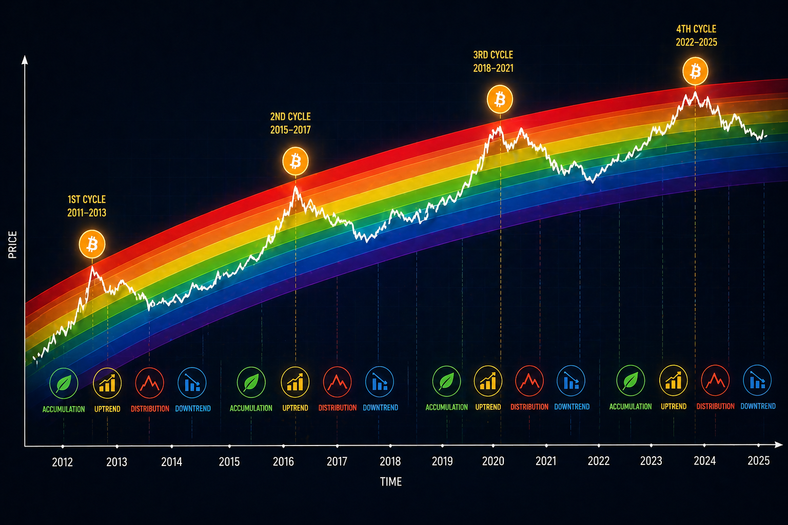
Relationship Between Rainbow Chart and BTC Cycles
The connection between the rainbow and market cycles is evident: during the height of a bull market, the BTC price rapidly climbs toward historical highs, entering the upper bands. Conversely, the end of a cycle is often accompanied by a sharp crash. The BTC Rainbow Chart clarifies exactly where we stand on this “pendulum” at any given moment.
Many traders use the bitcoin rainbow chart to try and “time” the cycle — buying the asset at the lowest possible price and selling at the peak. When the market reaches a state of euphoria, the chart signals overheating, and during moments of depression, it shows that the asset’s price sits well below its historical trajectory.
Historical Examples Using the Rainbow Chart
Historically, the original rainbow chart bitcoin successfully kept the price within its boundaries for a long time. During past bull runs, the price repeatedly touched the red “Maximum Bubble Territory” zone, which always foreshadowed a serious correction.
However, Bitcoin’s history is full of surprises. A striking example occurred in 2022, when the price showed several sharp “wicks” that broke outside the boundaries of the then-current rainbow model. This demonstrated that even time-tested charts can fail under the pressure of unprecedented market conditions. In response, the developers launched the updated Rainbow 2023 version; it now includes data up to 2022 and explains each price movement more accurately, though it offers a less “bullish” trajectory for future growth.
How Accurate the Model Has Been
Regarding accuracy, it is vital to remember that the rainbow bitcoin lacks a strict scientific basis. It is an engaging and visual way to interpret past data rather than a prophetic tool.
- The model relies solely on historical indicators, which do not guarantee similar results in the future.
- While the rainbow btc chart has excelled at describing past cycles, it cannot predict fundamental shifts in demand or global economic shocks.
- Developers created the Rainbow 2023 model by fitting two curves — one for historical highs and another for lows — to align the chart with modern realities.
Thus, the model’s accuracy remains high only as long as Bitcoin continues to follow its established patterns. As the creators openly warn: you cannot predict the price of Bitcoin using the rainbow, but you can use it to understand the context.
Limitations and Criticism
Despite its visual appeal and status as a cult tool in the crypto community, the bitcoin rainbow chart has several serious limitations that every user should be aware of. The creators of the model on the Blockchaincenter website openly state: “You cannot predict the price of Bitcoin with the rainbow!”. It is an engaging way to observe the market rather than a precision analytical instrument.
Lack of Scientific Basis
The primary argument from critics is that the rainbow btc chart lacks a genuine scientific or economic foundation. While other models attempt to account for supply volume, hashrate, or the number of active addresses, the rainbow relies exclusively on fitting a curve to past price values. This makes the tool vulnerable to new market conditions that the asset’s history has never seen.
The Problem of “Overfitting”
The history of the chart’s updates clearly demonstrates its main weakness. The original rainbow chart bitcoin maintained its reliability until the BTC price broke its lower boundary in 2022, performing several deep “wicks” outside the bands. This failure forced the developers to create the Rainbow 2023 version, where they adjusted the formula to “beautifully” describe the price action once again.
Key Points of Criticism
Sources highlight several major flaws:
- Dependency on history: The model assumes Bitcoin will always follow a path of logarithmic growth, but past performance does not guarantee future results.
- Ignoring macroeconomics: The crypto rainbow chart does not account for inflation, Fed interest rates, or global geopolitical crises, which currently influence the crypto market more than ever.
- Subjectivity of zones: The creators chose the color boundaries and their names (like “Maximum Bubble Territory”) arbitrarily, and these zones lack a mathematical basis for risk levels.
Risk of “Black Swans”
Investors using the btc rainbow as their sole information source risk missing moments of fundamental market shifts. If demand reaches unprecedented levels, the price could stay above the red zone indefinitely; conversely, a prolonged bear market could keep the price below the blue band longer than an investor’s budget can withstand. Ultimately, it is an excellent tool for managing emotions but a poor foundation for serious risk management.
Future of the Bitcoin Rainbow Chart
The future of this tool depends inextricably on its ability to adapt. After the original model faced difficulties in 2022, the creators chose evolution over invalidation by introducing Rainbow 2023.
This new iteration of the bitcoin rainbow chart uses a completely revised formula. Developers fitted two curves: one describing historical highs (the red line) and another describing only the lows (the blue line). Interpolation fills the space between them, creating a model more resilient to market anomalies.
What to Expect from the BTC Rainbow Chart in the Future
- A less “bullish” trajectory: Creators admit that the potential price path in the new model is not as aggressive as in the old version. This reflects the maturing of the asset and a gradual decrease in volatility as market capitalization grows.
- Interactivity: The modern rainbow bitcoin chart allows users to scale the graph and study specific periods in detail, with deeper real-time data integration expected in the future.
- Cultural Heritage: Regardless of its lack of scientific basis, it remains a visual way to view long-term trends while ignoring daily “noise”. It will continue to serve as a sentiment indicator for millions of investors.
Conclusion
The bitcoin rainbow chart is more than just an aesthetically pleasing graph; it is one of the most accessible tools for understanding market sentiment and long-term cycles. Its main merit is helping investors filter out the daily “noise” of volatility to see a global perspective within a multi-year history.
Through the btc rainbow chart, we see how the first cryptocurrency moves through phases of accumulation and overheating, following the logic of logarithmic regression. The update to Rainbow 2023 demonstrated that the tool can evolve to fit new market realities, offering more balanced, though less aggressive, forecasts. Nevertheless, investors should treat the rainbow chart bitcoin as a visual guide and a way to control emotions like fear and greed, rather than a scientific method.
Ultimately, success with the rainbow btc chart depends on the investor’s ability to maintain composure and critical thinking. No chart can predict the future with absolute certainty. Use it as a psychological compass and part of a comprehensive strategy, and this tool will remain a reliable ally in understanding the complex world of Bitcoin.
Published Articles
 Popular
Bitcoin Pizza Guy: The Story Behind the First Real Bitcoin Purchase
Introduction The history of Bitcoin is full of dramatic ups and downs,...

How Bitcoin ATMs Work: A Complete Guide to Using Crypto ATMs
Introduction Millions of people around the world use cryptocurrencies today – at...

Best Bitcoin Mining Software of 2025 – Top 7 Tools for Maximum Profitability
Bitcoin mining has long since moved beyond being a hobby for enthusiasts...

Services You Can Pay for with Bitcoin
Where Bitcoin Is Accepted Today Today, Bitcoin (BTC) can be used to...

What You Can Buy With Bitcoin in 2025
Introduction Over the years, Bitcoin has evolved from an experimental digital currency...
 Popular
Bitcoin & Crypto Options Trading: A Complete Guide for Beginners and Experts
Bitcoin options trading has grown rapidly in recent years as the cryptocurrency...